Flow Map Family Tree Flow Map (1887 - 1924)
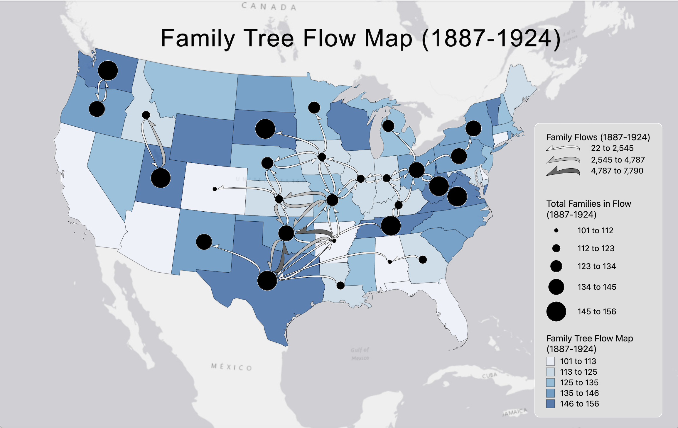
The flow map is designed to visualize the movement of people between different regions in the United States. The base map is a choropleth map of the United States, showing the population density of each region. This is used to provide context for the flow data, which is represented by flow lines. The flow lines are drawn between nodes, which are represented by point symbols. The point symbol is a circle with a size proportional to the population of the region. The flow symbol is an arrow, with the arrowhead indicating the direction of the flow. The width of the arrows is proportional to the number of people moving between the two regions. The color scheme for the map is designed to make the flow patterns easy to interpret. The background choropleth map uses different shades of blue, with light blue representing low population density and dark blue representing high population density. The nodes are colored black, making them stand out against the background. The flow lines are colored gray, making them stand out against the background and the nodes. This color scheme allows the user to quickly and easily identify the regions with the highest population density and the regions with the most people moving between them. The title of the map is "Family Tree Flow Map (1887-1924)". The legend includes the meaning of the different symbols and colors used on the map. The flow lines indicate the movement of people between two regions, and the width of the arrows indicates the number of people moving between them. The nodes indicate the population of a region and the color indicates the population density. The flow map reveals several interesting patterns. Some regions, such as Texas, attract a lot of people from other states, while other regions, such as the Midwest, send a lot of people to other states. The flow lines also reveal families tend to move to states nearby as opposed to across the country.